ZUUS
Logo evolution case study for ZUUS Technologies.
To provide a clear demonstration of logo evolution, ZUUS Technologies is a mock brand created specifically to showcase how a company could update its logo to align with design trends from different eras while staying true to its visual identity.
ZUUS Technologies is a computer company that was designed to display the implementation of logo trends through three logo variations that each represent the styles of the 1970’s, 1990’s and the present day, and show how each logo would be utilized respectively.
Created in Illustrator and Photoshop.
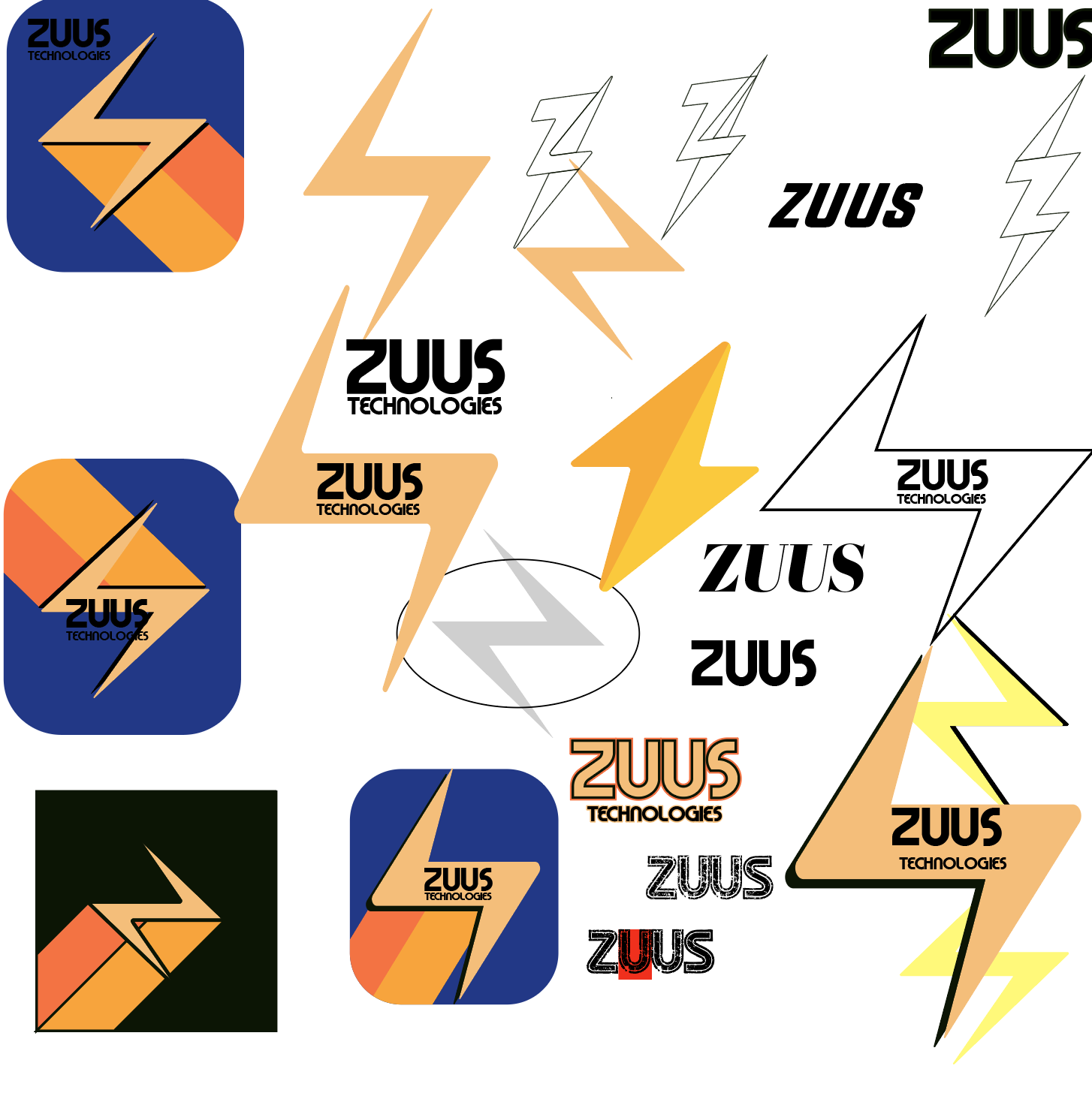
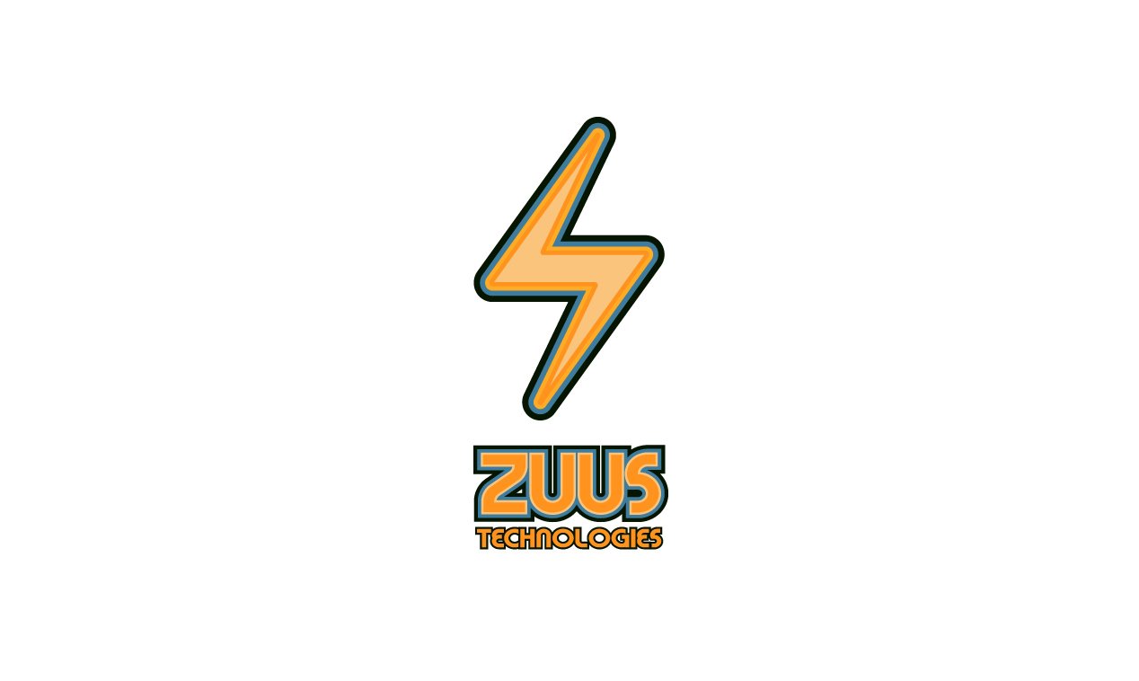
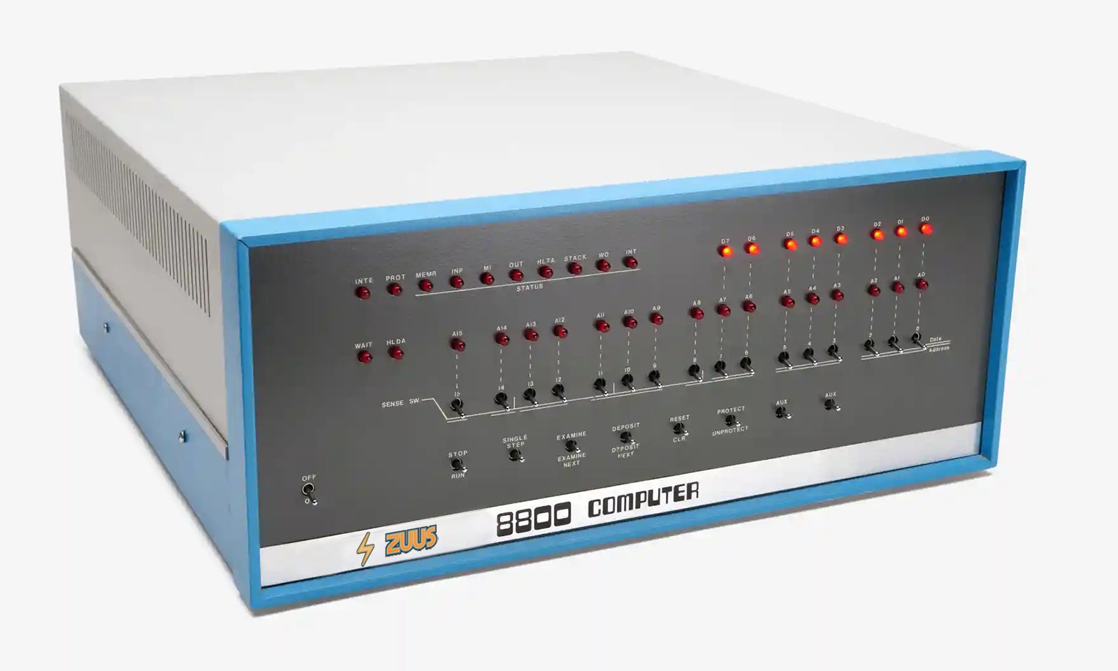
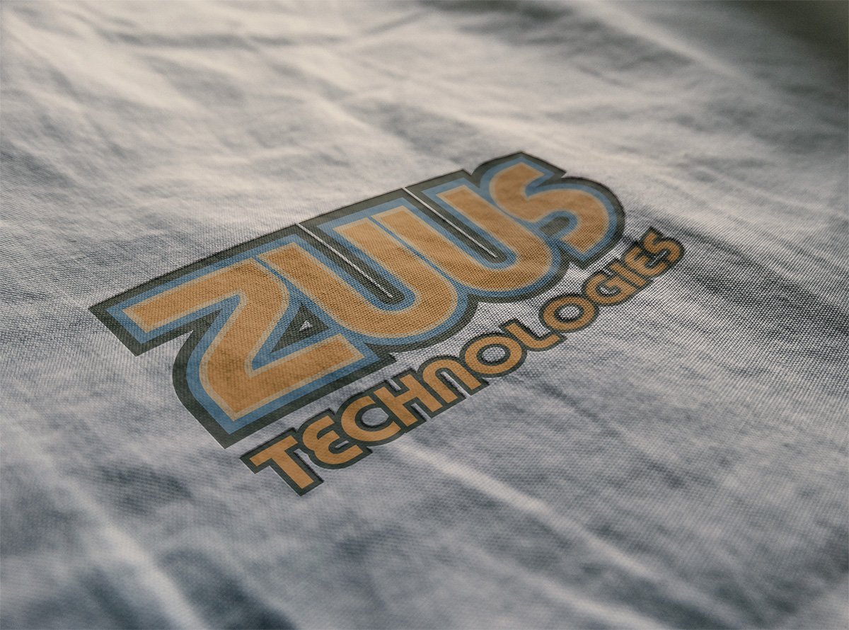
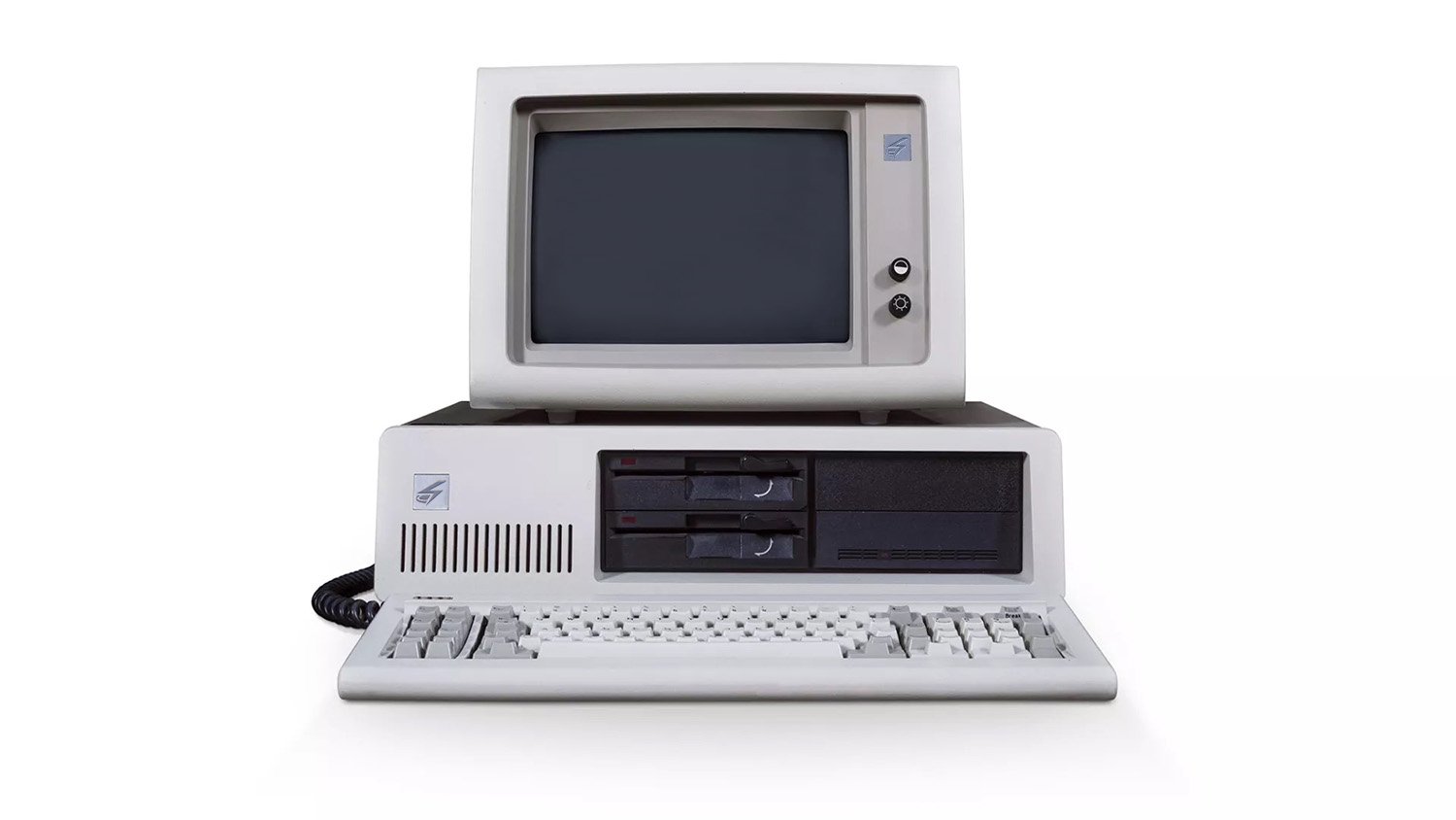
1970’s Logo
The original ZUUS Technologies logo draws inspiration from the vibrant aesthetic of the 1970’s, incorporating iconic elements from that era into its design. The logo features a captivating thunderbolt emblem that gracefully hovers above the brand's word mark. This symbol combines soft shades of yellow and lustrous orange tones with blue in one of the outline strokes, capturing the essence of the 70’s with its warm color palette, but with a hint of coolness.
The thunderbolt itself sits flat upon multiple thick strokes that boast curvy edges, adding a touch of retro flair reminiscent of the distinctive style prevalent in numerous logos during the 1970’s.
The "ZUUS" word mark is equally crafted with attention to detail, featuring multiple layers and utilizing a thick, bold typeface that has a combination of round curves and sharp edges. The overall result is a logo that pays homage to the era while evoking a sense of nostalgia and energy.
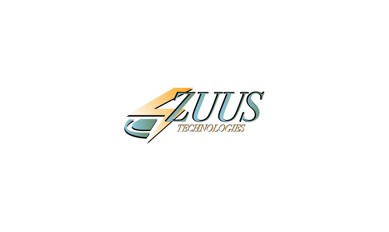
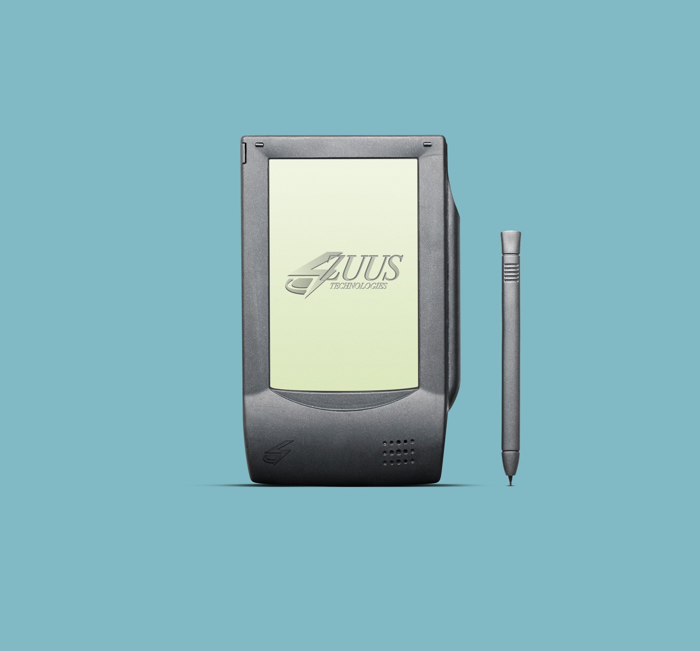
1990’s Logo
The following rendition of the ZUUS logo draws inspiration from the distinctive logo styles of the 1990’s. In this version, the brand's signature thunderbolt symbol undergoes a striking transformation. Departing from the traditional bolt design, the new logo adopts a more abstract representation with its asymmetrical shape and slanted position. This interpretation discards the rounded corners and layered strokes commonly associated with 70’s logos, embracing a sharper aesthetic.
The thunderbolt symbol is positioned prominently and has a sleek drop shadow that adds a dynamic touch. This shadow, slightly offset, creates an illusion of movement, a characteristic frequently observed in 90’s logo designs.
To the right of the symbol, the ZUUS Technologies word mark is elegantly displayed. It utilizes a slim, italic serif typeface, further emphasizing the logo's contemporary feel while maintaining a sense of sophistication.
Gradients are utilized throughout the entire logo and the light golden yellow is paired with teal hue, resulting in an overall cool and visually appealing feel. This combination of elements successfully pays homage to the 90’s era, evoking an aesthetic that would have been considered modern at that time. The logo stands as a testament to the brand's ability to blend nostalgia with contemporary design, creating a captivating visual identity.
Modern Logo
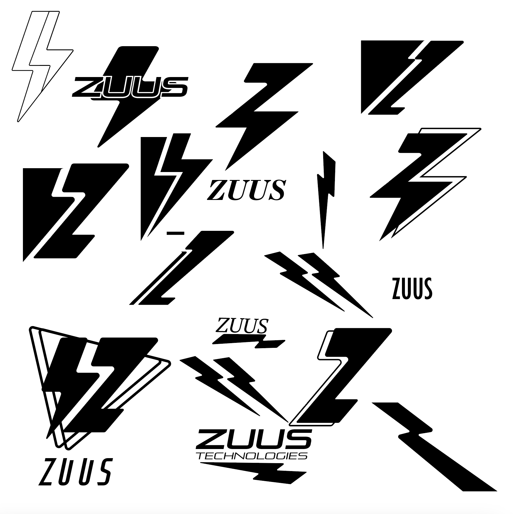
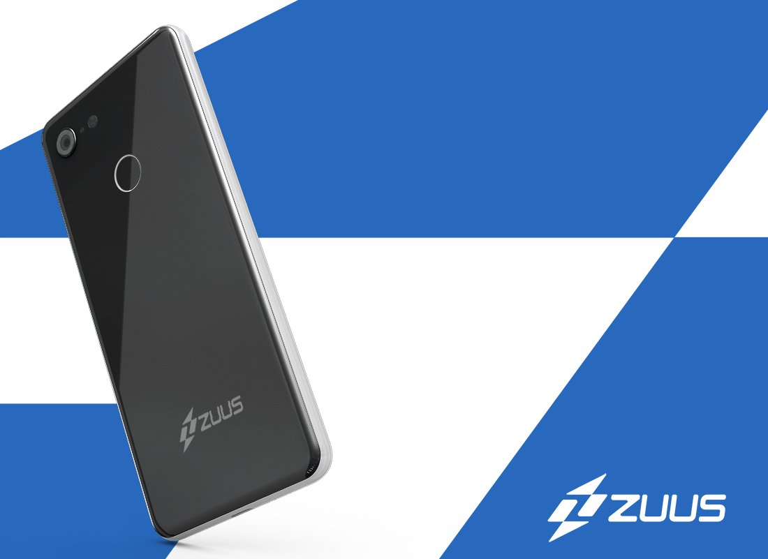
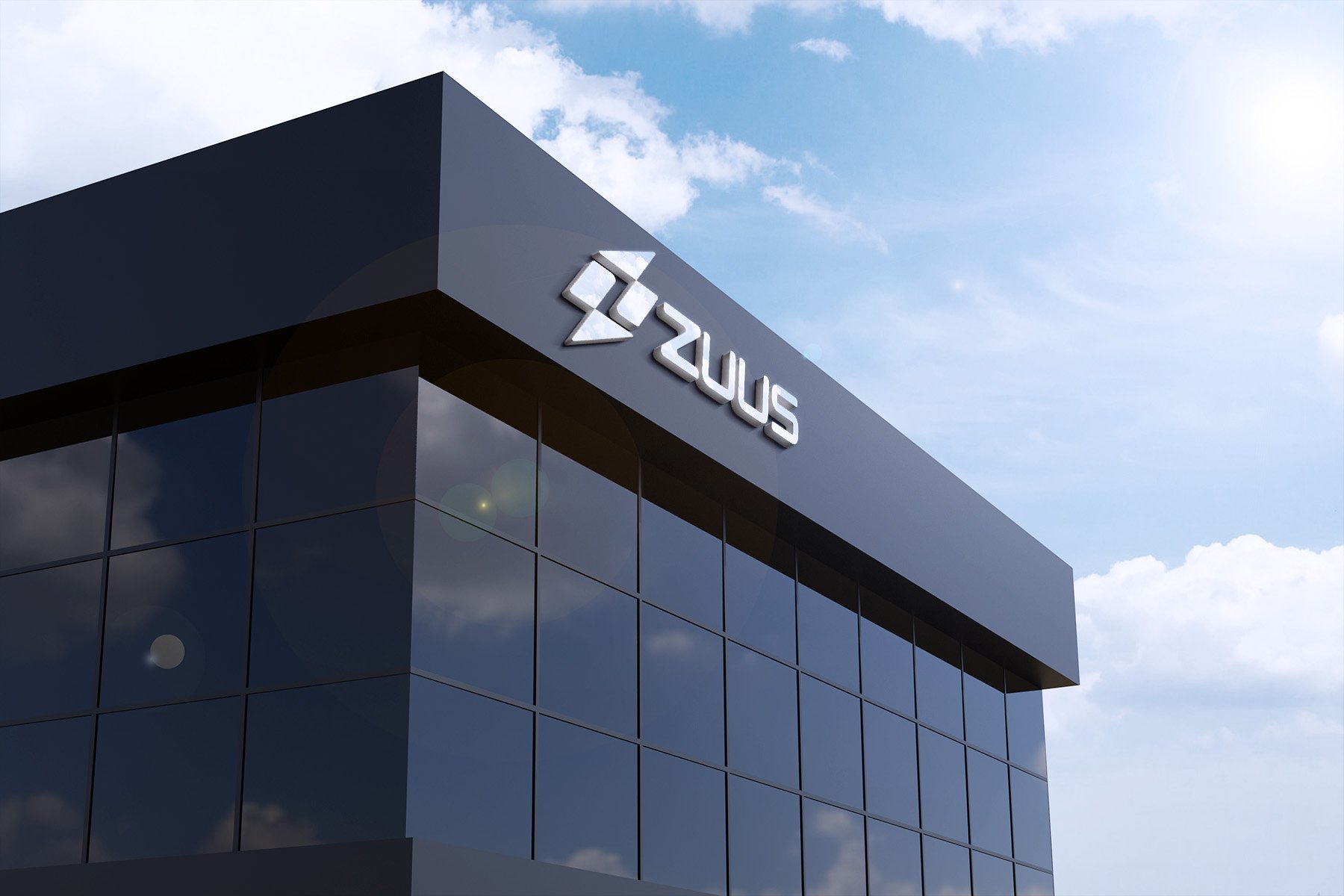
The contemporary rendition of the ZUUS logo incorporates elements that are prevalent in many of today's brand logos. The thunderbolt symbol manages to strike a balance between abstractness and simplicity, capturing attention with its unique design. Comprised of two sets of diagonally mirrored triangles and rectangles, the thunderbolt cleverly creates negative space in the shape of the letter "Z." This interplay of dynamic shapes adds a sense of intrigue to the logo.
In contrast to the boldness of the 90’s iteration, this logo takes a more subdued approach. It embraces a completely flat design and opts for a monotone blue color, exuding a modern and minimalist aesthetic. The simplification of the logo extends beyond the icon itself. Positioned below the thunderbolt is the word mark "ZUUS" in a contemporary sans-serif typeface. This typeface features rounded corners, adding a touch of softness to the overall design.
Notably, the word "technologies" has been dropped from the name, allowing the logo to be used effectively on a smaller scale. This strategic decision ensures the logo's versatility and adaptability across various applications and platforms. The combination of the abstract thunderbolt symbol and the sleek word mark creates a cohesive and visually appealing logo that aligns with contemporary design trends, reflecting the brand's modern identity.