Halo Cosmetics
Logo and packaging designs for Halo Cosmetics.
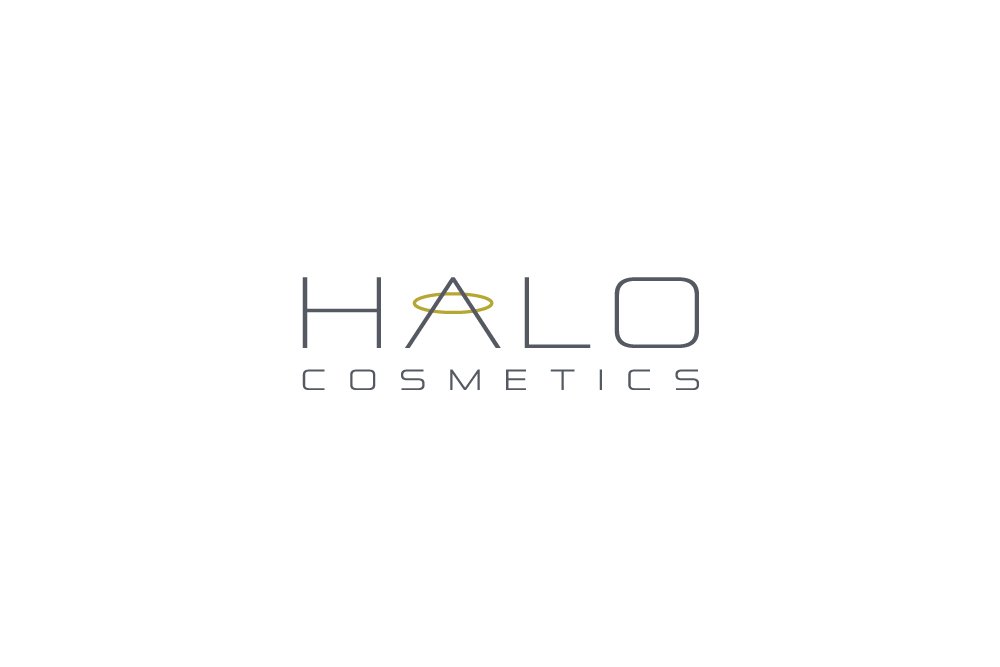
The Halo Cosmetics logo is a clean and modern representation of the brand's identity. It features a simple, elegant halo symbol encircling the brand name in a sleek and legible font. The halo serves as a visual metaphor for the brand's commitment to bringing out the natural beauty and radiance of its customers. The color palette chosen for the logo reflects a sense of sophistication and purity, with a soft and inviting blend of pastel tones. The overall design is created in Illustrator to ensure scalability and versatility across various applications.
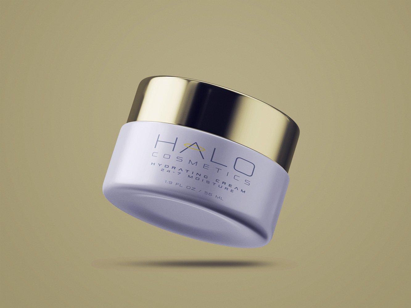
The packaging designs echo the brand's overarching aesthetic, combining elegance and simplicity to create a standout presence on the shelves. The primary color scheme is inspired by the logo, conveying a sense of purity and luxury. The minimalist approach allows the focus to remain on the product and the brand name, while subtle halo accents tie back to the logo, creating a cohesive brand identity across all products.
Created in Illustrator and Photoshop.